I’m a colour lover. No doubt about it. More is more, the brighter the better, if the colour combo gives you a headache that’s good I say.
Look at my stash of cotton yarn. Need I say more?
Even in the way I dress, I just HAVE to add colour. Today for instance I didn’t want to think about what to wear (we all get those days don’t we) so I’m wearing black trousers and a black shirt…. with turquoise shoes and earrings. I just can’t help it – I need to add a bit of colour.
I do have a palette that I instinctively stick to when I buy clothes or yarn for wearables. Mostly blues, greens and purples. By now my wardrobe is so colour co-ordinated that I can go into any shop and buy what I’m naturally drawn to – cool colours like blue, green, purple – and find that it will always match at least three other items in my wardrobe so I can mix and match to my heart’s content. I really love that! If you want to get technical, that means I like to dress in a Analogous color scheme.
When it comes to choosing a colour palette for a crochet item, key to me, is contrast. Colours have to “pop”.
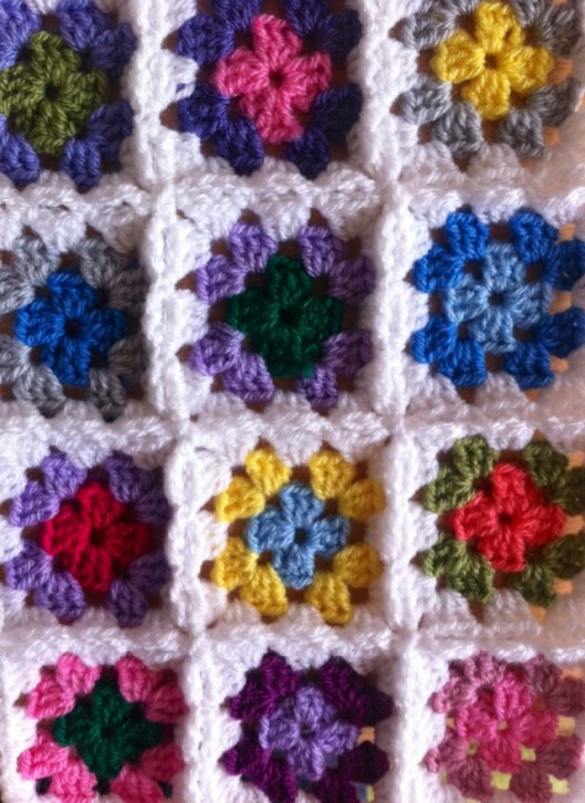
Almost every colour combo in the squares of this Roses and Daisies cushion “pops” against the very light grey background and against each other
As I like contrast, and I’m naturally drawn to green/blue/purple I sometimes have to use warm colours like red, pink, yellow or orange to create the contrast although those are not colours that I especially like. I especially don’t like pink so I try to use as little as possible of it in my own crochet.
However, for the granny square cushion I’m making for Lynn Holland I’ve used three shades of pink for contrast. I have to say it does work well. On it’s own pink is a no-no for me, but mixed up in a rainbow of others, it does serve its contrasting purpose.
See how the pink makes the colour next to it stand out? I just love how that works!
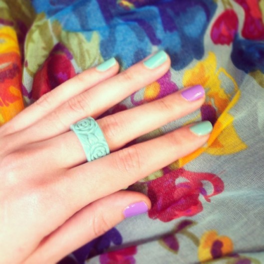
If you still don’t think I’m a colour lover, check out my nails. Case. And point.


I love colour too!!!!!!
A big WOW to everything the cushion looks fantastic as do your nails and I love your ring. Thanks for the colour chat it will be useful for the Tag Tuesday challenge. This weeks theme is PURPLE.
Have a great day.
Lynn 🙂 x
Beautiful colours Natasja 🙂 Lynn will love her cushion I’m sure:)
I am not very good at knowing what colour will compliment each other but now that colour scheme link you added here will help no end, so thank you for that 🙂
Have a great Monday 🙂
Mo x
I love the cushion, it’s beautiful and bright.
I’m most definitely a colour lover too. With my blanket there’s a bit of a contrast thing going on with some of the squares then a bit of a complimentary thing going on with other squares. It all depends on how I feel when I pull the yarns out of the box. I am having to make a conscious effort NOT to be left with lots of the colours I’m not so keen on though.
Colors is life ,joy ,nature, I undersatnd your taste for colors, and in crochet it brings us to create more and more just like a painter does!
Your cushions are lovelly, bravo,
FleurBelge,from Belgium
I love the granny square pillow!
Somebody once said to me: “You’re not scared of coulor, are you?” Guess I’m not. I LOVE coulor!!
Please save me from my typo’s! Colour!!
Long live COLOUR!!!
Glad I found your blog. See you around in Blog Week…
Ana BC
Love the colored yarn. I want a stash like that! I also love your nails. And your ring. And everything about this post. 🙂
Beautiful colours! I love your nails too!!!! I tend to dress in plainer colours with bright accessories, it’s so much easier to choose what to wear.
Here’s my post on colour: http://www.craftsfromthecwtch.co.uk/2012/04/kcbw-day-1-colour-lovers.html
Hope you enjoy the week!
x
Beautiful!! Cute manicure, too. 🙂
I am drawn to the same colors as you when I am looking at clothing and accessories.
Love your cushion, such gorgeous colors and shapes! Great blog, too!
I so noticed your affection for cool colors. The throwing in of some warm works very well. That a terrific, Granny cushion you hooked.
That’s one of my favorite things about your blog and creations – all the lovely color! It always brings a smile. 🙂
Thank you all for your lovely comments! It makes me very happy knowing that my colourful craziness makes you happy as well 🙂
Pingback: Business card anyone? « crochetime